Magazine Spread Reboot

Publication design has always been an interest of mine. I was involved in yearbook in high school, and through this, I found my love for design. Bold titles, well-set type, and eye-catching visuals are crucial parts of creating a spread. I was tasked to make a magazine spread of a current existing article by Outside Magazine. My randomly assigned article was about running shoes.
I spent time creating mood boards to reflect the possibilities of design that this article could offer. I began researching shoe brand advertisements. I looked at Nike, New Balance, Brooks, you name it. I wanted to incorporate a bright editorial design with an emphasis on the topic- running shoes.
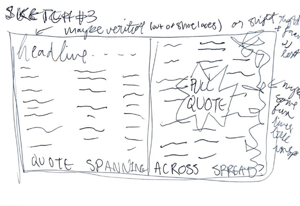
After I created my mood boards, I began sketching my designs. I incorporated visuals such as shoes, a track, and pull quotes. However, none of these sketches felt right. I then began experimenting with a single picture as the main visual. I grabbed a Hoka shoe (a trending running brand) and created a custom Illustrator brush to resemble a shoe lace. From there, I added a textured background, bright colors, fun shapes, footers and headers, and type. The most difficult thing for this project was typesetting a large amount of type. I had to be very aware of kerning, leading, tracking, orphans, and widows. I enjoyed catching a glimpse into the world of publication design.
The Design process
Sketches and mood boards that revolved around the desired layout and vibe for the final design.


