Typography poster

What is slowly becoming a lost art? My answer to this- quilting. I was asked to make a poster that included only typography to advertise a festival. I live for bright, funky, and eye-popping designs that call attention to events. I thought energetic design is just what quilting needs. I created a poster for the Vermont Quilt Festival to bring a new life to this event.
This process began by creating various mood boards based on desired characteristics I wanted in the design. I focused on three words- bright, funky, and fun. I ultimately decided to combine all three. From there, I created three drafts of the poster.
My final design consists of multiple details paying homage to the original quilt culture and the new branding I was aiming for. For example, the poster includes hand-rendered type, fake stitching on type, various textures, and fun shapes. I hope that as I continue in my career, I can create designs that redefine events and draw individuals in.
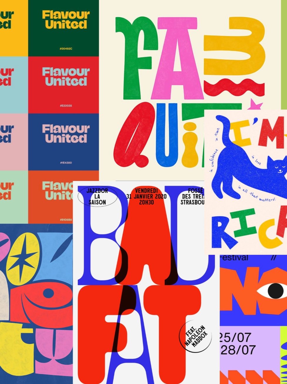
The Design process
A process consisting of mood boards, sketches, and ideations that revolved around bold shapes, bright color, and large type.


updates

BEFORE
After
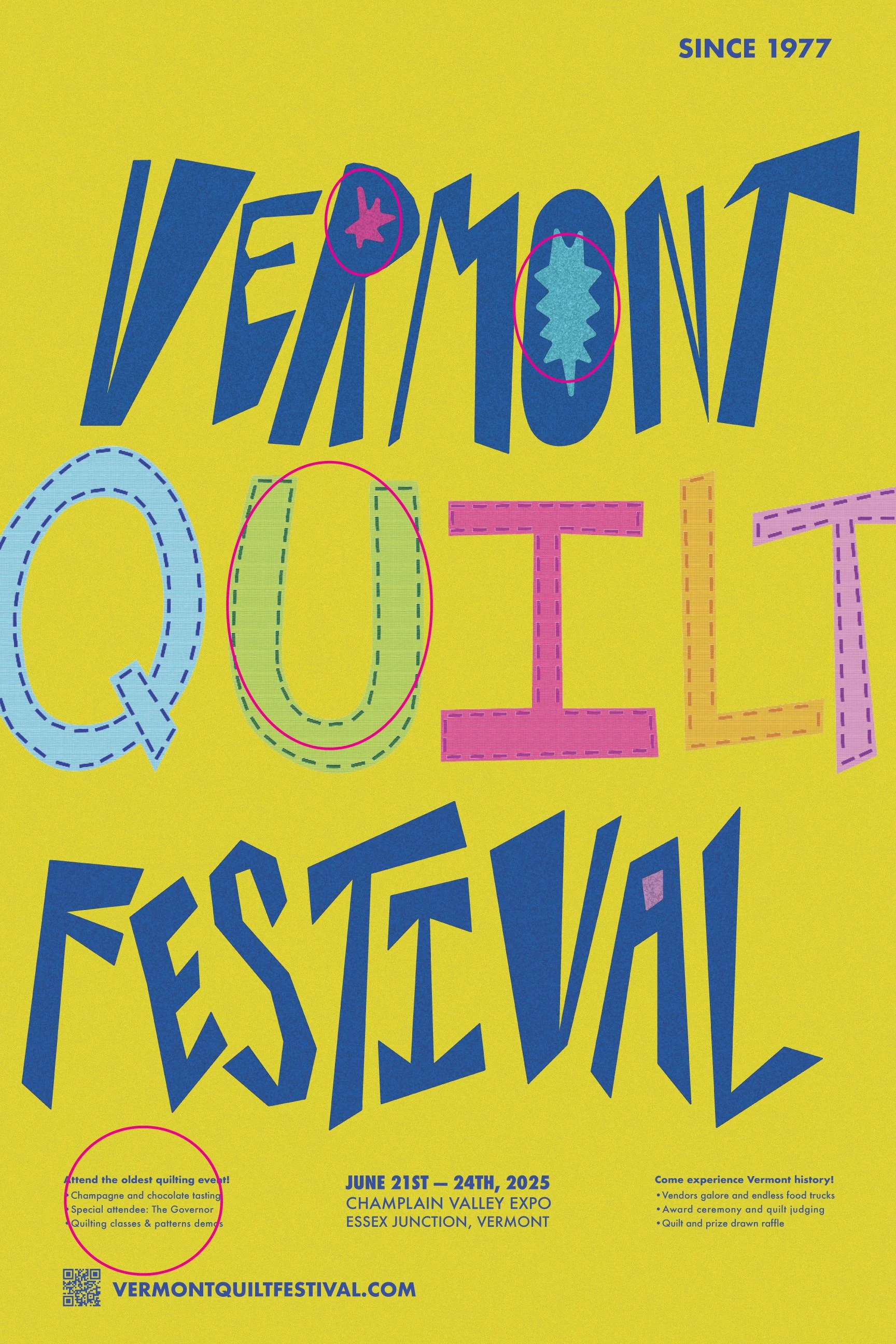
For changes, I focused on getting rid of rivers in the body text, cleaning my stitching up, and making the interior shapes in the letterforms more organic. Edits are indicated with the pink circles above.
The Design up close


the final design
