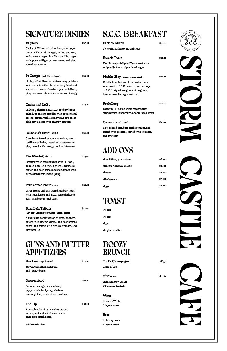
MENU DESIGN

Have you ever seen a design in public and thought, this could use some work? Well, I participated in a project that addressed that very statement. I redesigned a menu from a local restaurant to increase legibility and visual appeal.
I began by taking the current menu and marking it for improvements. I assessed font size, typefaces, layout, if it had orphans or widows, consistency, line length, and type setting. After I understood what I was working with, I began searching for inspiration and drafting sketches. I decided I wanted a bold title with clearly defined subsections. I completed hierarchy exercises and searched for typefaces.
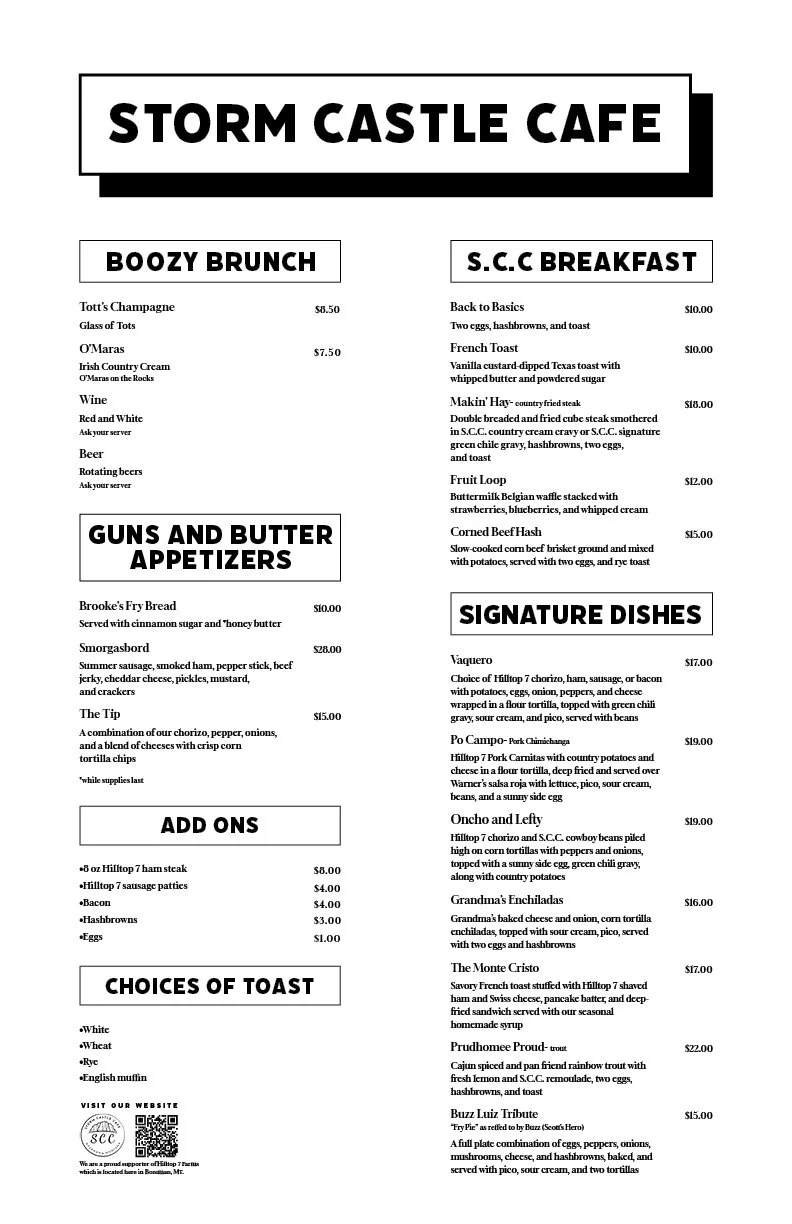
My final product consists of bold, black type with consistent spacing, leading, and content. I printed my menu on textured paper using a risograph printer. I also experimented with some color! Through this project, I learned the amount of detail required to set type, and by paying attention to detail, it creates a more effective product for users.
The Design process
Sketches, peer feedback, typeface exploration, and design exercises within the ideation process.


The Final DesignS