US City Branding

Ah, Nashville, the City of Music. Line dancing, country fashion, neon signs, and The Honky Tonk Highway bring the city to life. Nashville has become a popular travel destination for bachelorette parties, concerts, or weekend getaways. You would think a city with such vibrant tourism would have professional branding and impeccable marketing. However, the city does not possess a verified Instagram account or logo. When I was tasked with rebranding a U.S. city, I settled on Nashville for this reason. Additionally, I wanted to rebrand a city in the South since I have a deep appreciation for my Southern heritage.
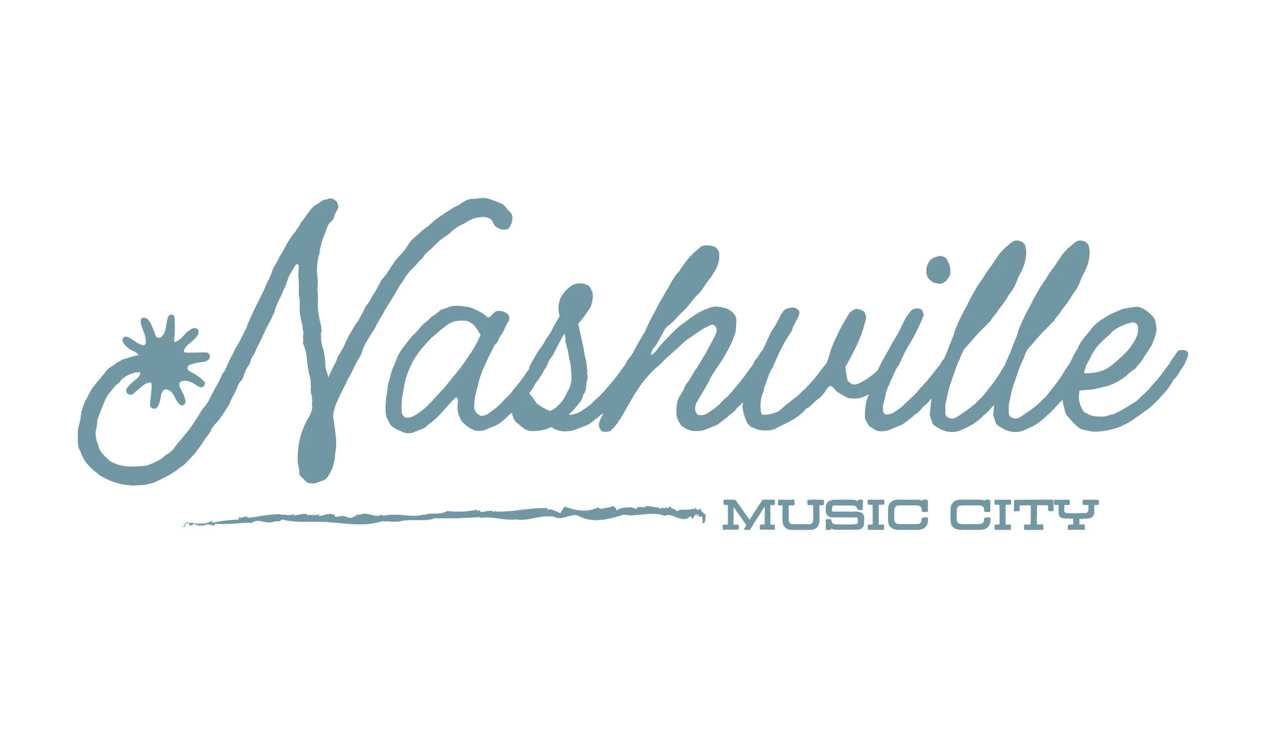
My main goal was to fuse two of Nashville’s identities together- Music City and the Country Capital. I wanted the logo to be dynamic and represent the vast opportunities and experiences Nashville offers. I decided to incorporate a star symbol with the letter N to resemble a spur. I placed the title, Music City, under Nashville.
From the logo, I created multiple deliverables. I produced a travel brochure with city history, activity recommendations, pictures, contact information, and a hand-drawn map. A stationary package was curated, including a letterhead, envelope, and a business card. Finally, a branding guide was included with brand colors, fonts, and logos.
The Design process
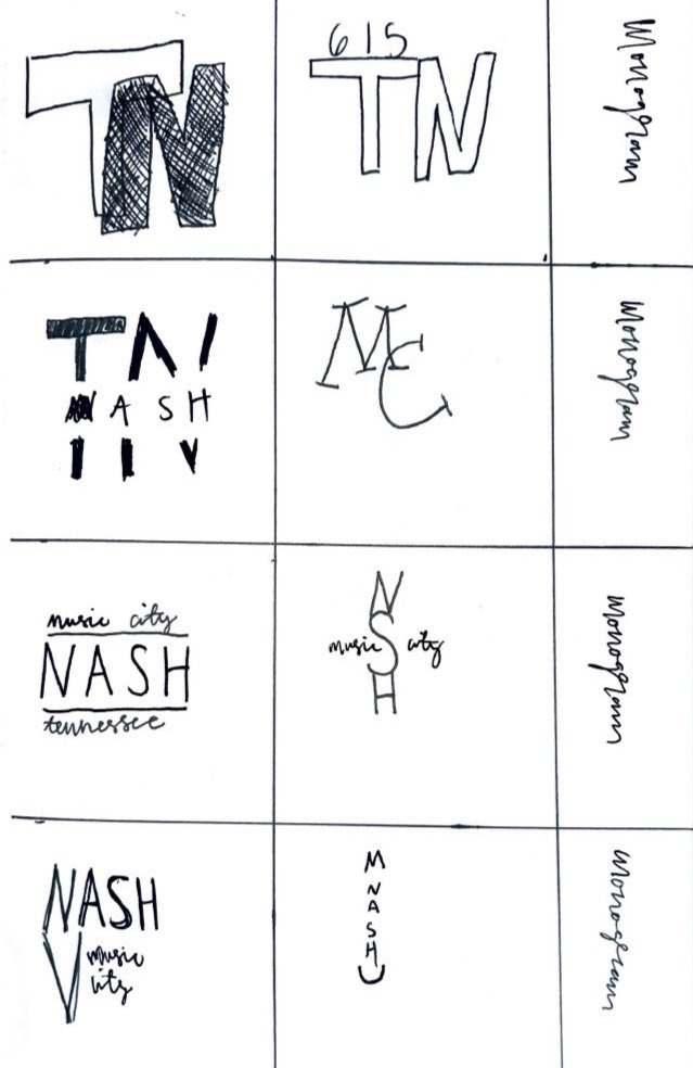
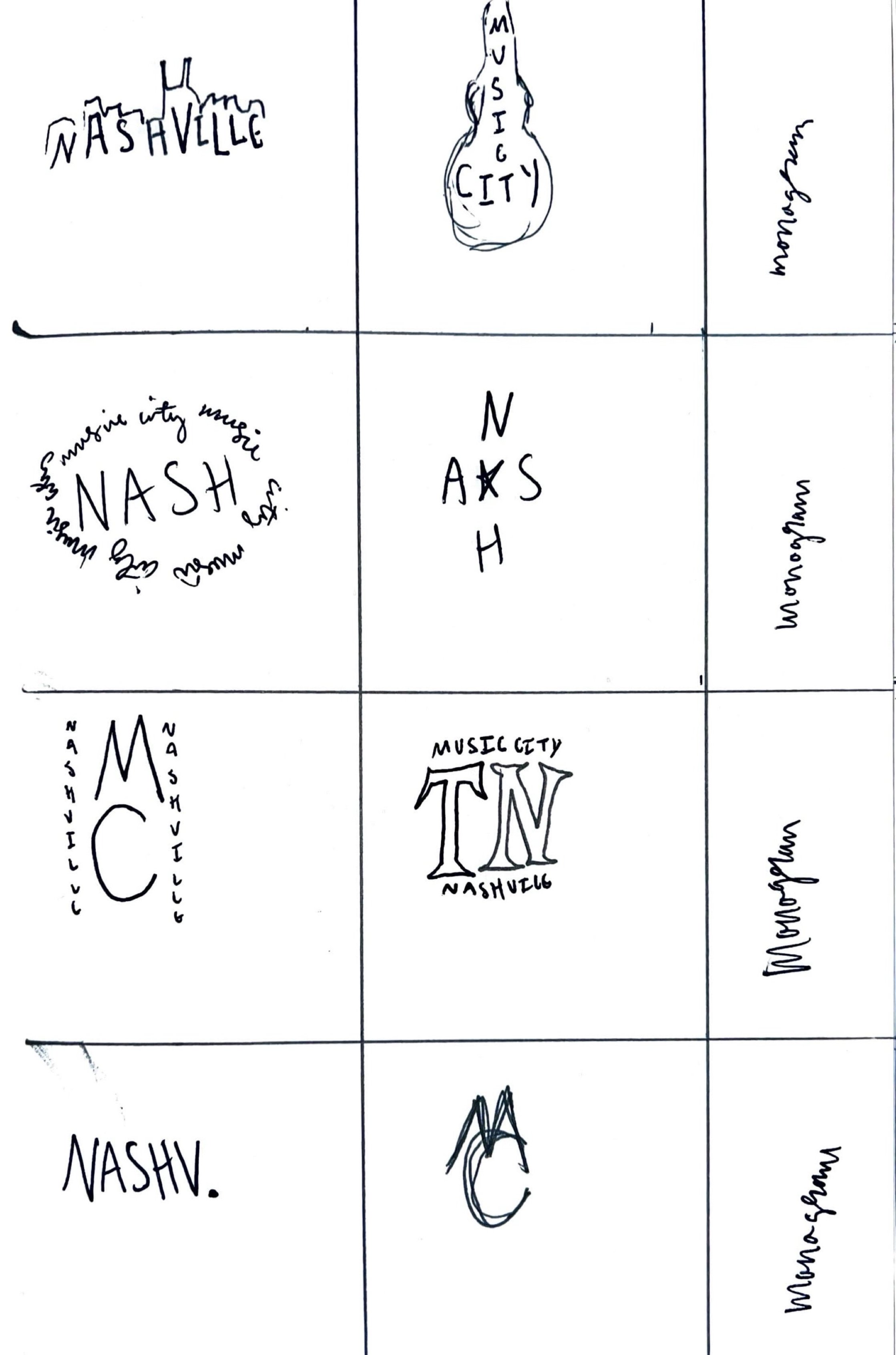
Explored monogram and combination logos through sketch ideations.


The Final Designs
First page of the brochure

Mockup of the stationary package
Second page of the brochure

Branding identity sheet

Third page of the brochure

Letterhead

Fourth page of the brochure


Front of business card

Back of business card
Mockup of the brochure

Black and white logo

Colored logo